
Loan Conversion Flow
OVERVIEW
Context. Prosper is an online, peer-to-peer personal loan solution.
Problem. ~75% of loan applicants abandon Prosper after finding they're ineligible for a loan.
Partner. We partnered with loan provider, AmOne, to offer customers this experience.
My Role. I led research and worked with a designer to optimize the UI and copy.
Result. Our optimization saw conversion to the AmOne page increase from 25% to 65%.
SKIPPING TO THE SOLUTION

Ultimately, our work produced two major outcomes:
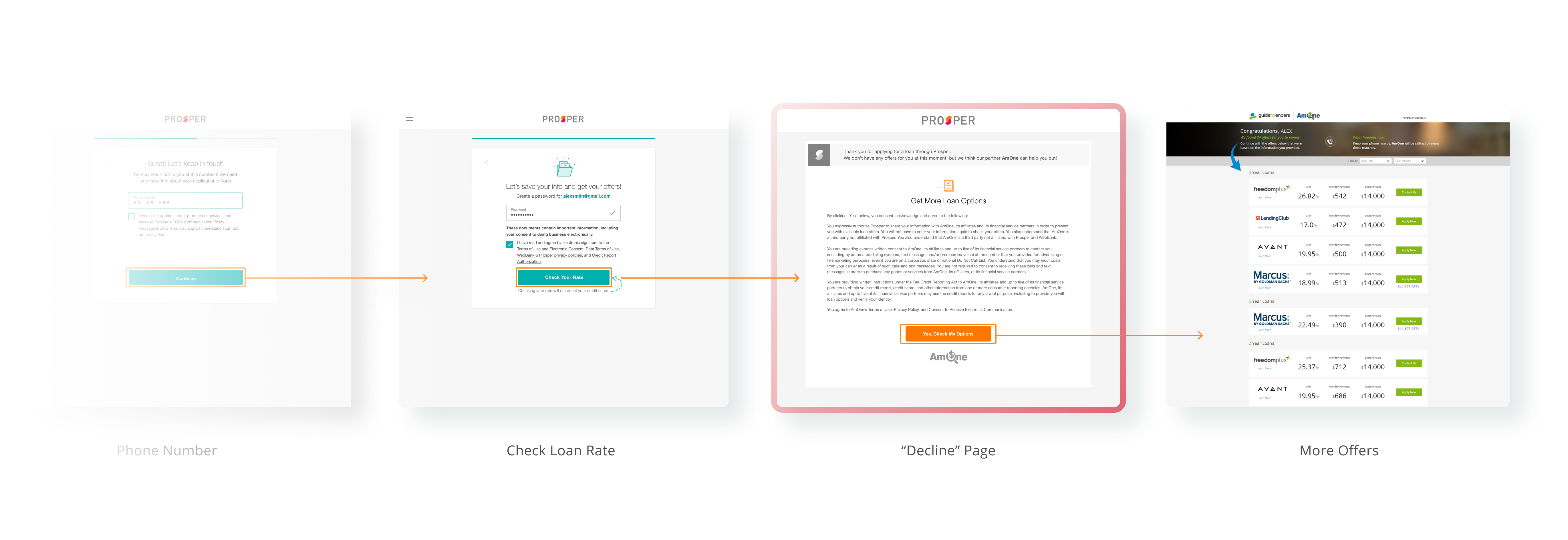
- We updated and reframed the initial "decline" page to make it look a part of the Prosper experience, instead of like an advertisement for another lender.
- We introduced a new pathway for users who had been declined individually, but were still candidates for loans with a co-applicant. These customers are encouraged to quickly check their rate with a co-applicant or see more options.


PROBLEM STATEMENT
For some ineligible applicants, Prosper offers the opportunity to instantly apply with a partner lender: AmOne. Although they're ineligible for a loan through Prosper, these applicants possess a credit score and income level that may qualify them for an AmOne loan.
Only 25% of Prosper applicants chose to apply with AmOne, while other lenders partnering with AmOne saw conversion averaging ~55%.
PROJECT GOALS
We agreed on team metrics for success at the onset of the project.

Increase applicant conversion to AmOne from 25% to 55%.

Emphasize continuity by making the decline page feel like the next step.

Improve transparency by exposing disclosure text in a deliberate, helpful manner.

Explore ways to make the AmOne offer more appealing, both in copy and styling.
METHOD
To deal with an optimization challenge like this, I suggested we step back to map existing user journeys. We could layer on learnings from user interviews and comparative analysis to expose the pain points of these journeys.
I partnered with a fellow designer to answer: why this discrepancy in conversion, and what part of that is attributed to customer experience?

User Journey
Although our conversion problem tracked to a single page, I expected that its origins were linked to the broader customer journey. We observed that an applicant must first fill out 9-13 pages of information before ever seeing this decline pathway. Plus, some journeys resulted in an applicant seeing the same decline page twice.

VALIDATING ASSUMPTIONS
We ran a user test on 5 participants. All participants were asked to apply for a personal loan with Prosper. At the end of their application, each participant was shown the existing decline message.
- All participants were surprised by the decline page. Participants expected to see details on their loan offer.
- Customers felt the application was a waste of time. Plus, none of the participants understood that continuing with AmOne would not require they reenter their info.
- Applicants thought the message looked like an ad. After completing an application with sensitive personal information, this was not received well.

TEST 1A: HYBRID VISUALS
One of our assumptions was that users were confused why part of the page looked like it belonged to Prosper and other parts belonged to AmOne.
We hypothesized that by more clearly distinguishing the AmOne brand from Prosper's, we could improve transparency and thus trust. We tested this by separating the Prosper notice at the top of the page from a dedicated AmOne panel and intentionally incorporating AmOne colors.
Participants did not respond well to the AmOne branding, and reported it still felt like an ad. Plus, only 1 user of 5 tested noticed the helpful bullets we added to summarize the bulky disclosure.

TEST 4: PROSPER-STYLES
Now, we hypothesized that by making the decline experience feel like the next step of the application, we could reduce surprise and frustation. For the next concept, we adjusted all panels and colors to match Prosper styles.
Participants were more likely to read the Prosper-style page even though some were still surprised to see it in the first place. This stylistic approach was a success over other trials.

A NOTE ON TRANSPARENCY
We aimed to build trust and transparency through our work. That goal partially manifested in a strict requirement that the AmOne disclosure appear legibly above the CTA. We could play with how this information appeared, but it was important that our customers understand this step before moving forward.
Although the disclosure increased page height - particularly for mobile - perceived trust from test participants was moderate to high.

A/B TESTING
The new page exceeded our expectations, and click-through improved by 40%, normalizing at ~65%. In other words, over half of eligible applicants pursued their options with AmOne. The new AmOne page has since rolled to 100% of eligible applicants.

ALTERNATE JOURNEYS
Some Prosper applicants do not qualify on their own, but may be good candidates for co-applicants. We identified this flow in our user journey map, and since the release of our new decline page, we've adapted our copy to fit the use case.

LESSON LEARNED
This project emphasized the importance of trust and transparency. Despite including a bulky, jargon-filled disclosure, users responded more kindly than when we tried to appeal with "flash". Sometimes, the simplistic approach is the most appropriate.


