
Prosper Invest
OVERVIEW
Problem. Investors on the Prosper Invest app struggle to invest in individual loan listings, leading to idle cash.
Constraints. Our solution had to comply with all financial regulations.
My Role. I was the sole designer and UX researcher. I worked with a PM and four developers to implement the final result.
Result. Our team released the ability to invest on mobile, and updated our information architecture to improve discovery.
Solution

In April 2020, our team launched an end-to-end experience for investors to purchase new investments manually via the Prosper Invest app.
- The new UI integrated seamlessly into the existing investment app.
- We streamlined and polished the manual investment experience by focusing on 3 key phases: browsing, researching, and purchasing.
- We improved discovery of invest functionality in general - surfacing the feature when and where it's most relevant.


THE PROBLEM
After the launch of Prosper Invest in August 2019, I worked with our PM to monitor feedback that revealed two things:
- Purchasing individual investments is difficult. Prosper Invest allows users to invest automatically, but manual invest requires logging into the web. Investors found this tedious and time-consuming.
- Users don't know where to start. This suggested an IA challenge, and suggested we weren't surfacing the functionality in the right way.

OUR PROCESS
We used this opportunity to devote time to some deep discovery work and research. We focused on evaluating the current investment process compared to our customers' mental models.

DISCOVERY
I conducted 2 user tests and observed 10 participants on our mobile and web products to answer several questions:
- How do investors purchase new investments today?
We found that investors enjoyed comparing key metrics like yield and investment grade in a visual list. - How does user behavior differ on web and mobile?
Experienced and novice investors found the web experience overwhelming. Experienced investors struggled to locate investment details and novice investors were confused by some terminology. - Where do investors start?
We observed that investors on the native app could not find the invest screen. 4 of 5 participants looked to the Account screen first when trying to update their investments.
INFORMATION ARCHITECTURE
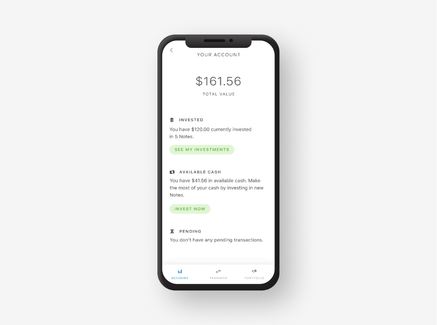
Prosper Invest has three main sections: Account, Transfer, and Portfolio. When I mapped the user journey, I noticed users getting stuck in two places: viewing their account balance and looking at their investment list. Users expected to invest from these pages, but couldn't.

To solve our discovery problem, I recommended correcting two user journeys to reflect our users' expectations. That way, we could test if we needed a bigger IA overhaul to expose the invest feature.
IDEATION
I experimented with making the investment experience more approachable by building in shopping patterns. My concept testing revealed the following:
- Shopping patterns tested well. Everyone picked up on the add to cart, filtering, and check out concepts.
- Investors prioritize "yield". Nearly all participants ranked yield as the most important investment factor, followed closely by investment grade and loan amount.

VISUAL DESIGN
I used the Prosper Invest design system to evoke themes of simplicity and clarity. The final mocks are whitespace dominant, and blue is used to attract attention and signal action. Upon a successful purchase, colorful confetti falls from the top of the screen.

PUTTING IT ALL TOGETHER
The manual invest experience naturally complemented our pre-existing AutoInvest feature. Each time an investor chooses to update their portfolio, they can choose to update their target allocations, or pick their investments manully.

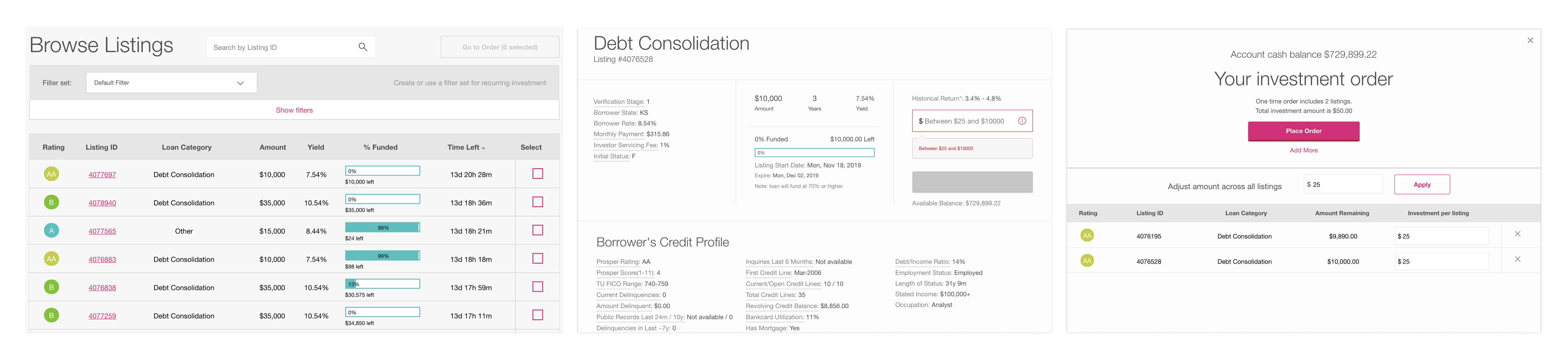
Browse and Select Listings
Data suggests that 30% of investors never look beyond the summary. These speed shoppers can quickly compare what's available and checkout without getting bogged down by the details.
Loan Details
It's important for more thorough investors to see the details of a loan and its borrower before making a decision. A tap adds the listing to the investor's cart.
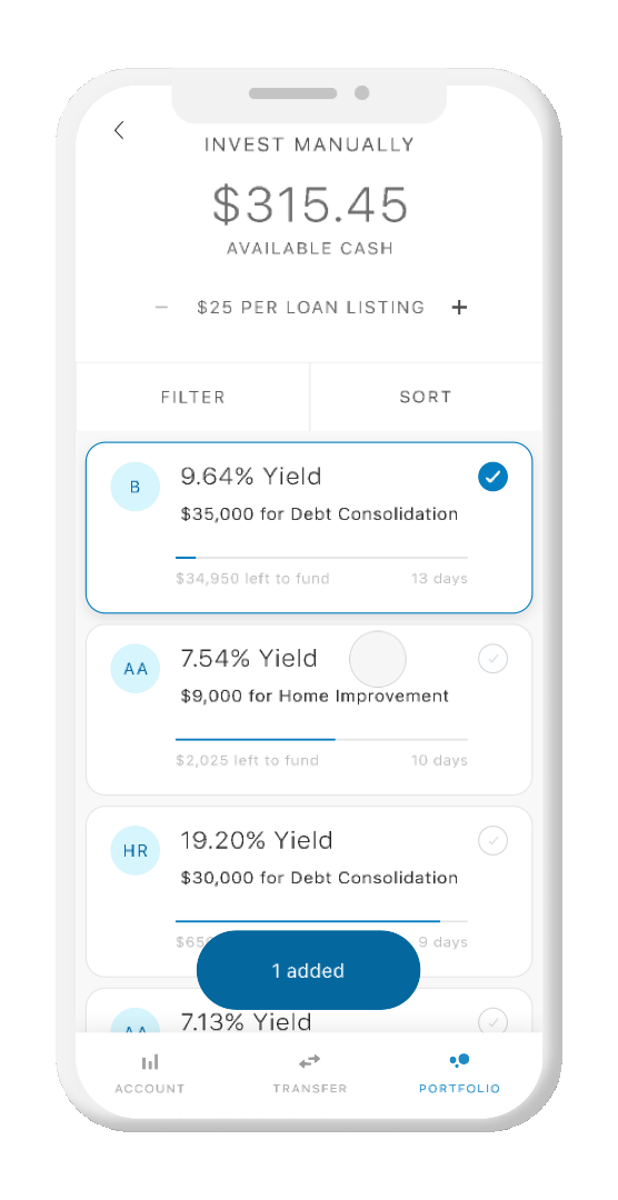
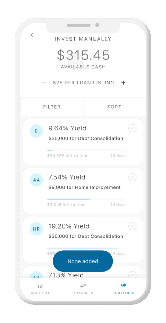
Filter and Sort
Some investors keep very specific portfolios, and it's essential to support them. To streamline this process, only the top 12 filters and sorts are available, as opposed to the 30+ online.
TEST AND LEARN
We released the update in early April 2020! At the time of writing this, it's early to draw too many conclusions, but some Google Play Store reviews may give insight.
We continue to track feedback in a variety of formats including from the App Store and our own usage data. We'll be looking closely at trends in transaction size, investments per transaction, and any errors.

NEXT: MONITOR & OPTIMIZE
Since going live, our PM and I have tracked ongoing goals for investments. Here are a few:
- Approachability And Learning. The experience right now is catered mainly to intermediate and experienced investors. With a few tweaks, we can simplify complex copy and provide guidance to get novice users started.
- Personalization And Empathy. I explored a few different ways to make finance feel more human. With more fine-tuning, I think we can improve the personalization many of our investors appreciate.
- Save For Later. I discovered that some investors prefer to shop, tentatively add investments to their cart, and come back later to purchase. Unfortunately, the app doesn't support this functionality today.


